
Left or Right? The Dilemma for Snack Brands
When it comes to package design, the decision where to place product photography can have a huge impact on sales.
Have you spotted any trends in the positioning of product photography with different brands? For bars and biscuits, the snack image is often positioned to the right hand side of the package. For healthy snacks such as crackers, the imagery is usually placed to the left.
The location of the snack image influences how heavy we perceive the treat to be.
We perceive products to be heavier when the product imagery is placed at the bottom, right and bottom right. Conversely, the ‘lighter locations’ are thought to be at the top, left and top left. We generally associate low level objects to be heavier for obvious gravitational reasons. Our concept of right-heaviness originates from the visual perceptions of the ‘lever effect’.
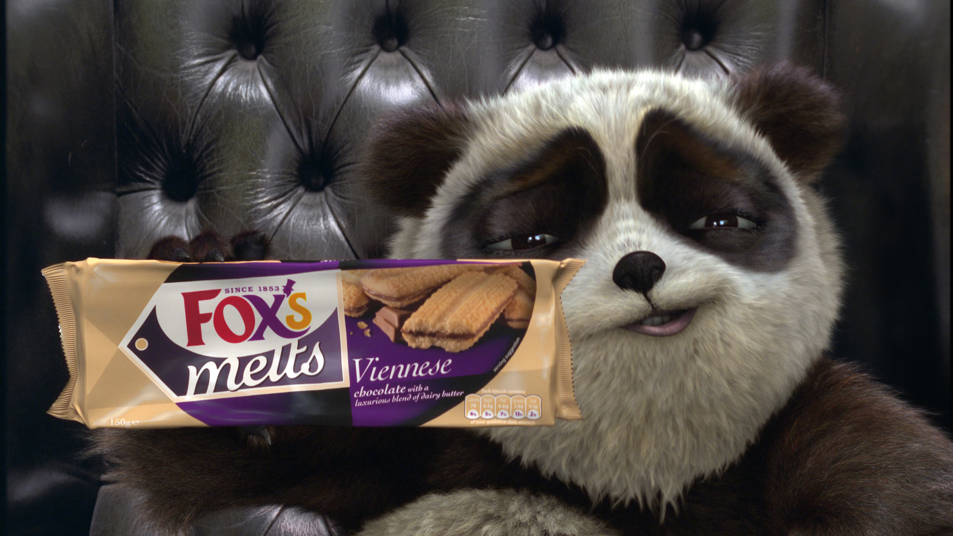
In the snack world, consumers prefer biscuits and treats that are heavier as they presume they are getting more value for their money. Manufactures know this and place product imagery to the right on the packaging. Good examples include Fox’s biscuits, McVitees Digestives and Jacob’s Fig Rolls. However, if you’re trying to lose a few pounds, you’ll want to go for something that is light but tasty. Not surprisingly, imagery for healthy snacks such as crackers are often found at the left hand side.
Not every company follows these positioning rules. Some are restricted by brand guidelines while others prefer different locations to complement other branding elements such as the product shape, company logo and the colour scheme.
